Key facts
- Message hierarchy
- Offer, then deadline, then action - in that order, in that many words.
- Banner size
- 600 × 150 px works for signatures; 600 × 200 px suits campaign emails with a logo.
- Swap plan
- Build three variants up front: teaser, live sale, last chance.
- Contrast
- Dark backgrounds with one high-contrast accent read fastest in a crowded inbox.
- Fallback
- The discount and the CTA must sit in the first frame for non-animating clients.
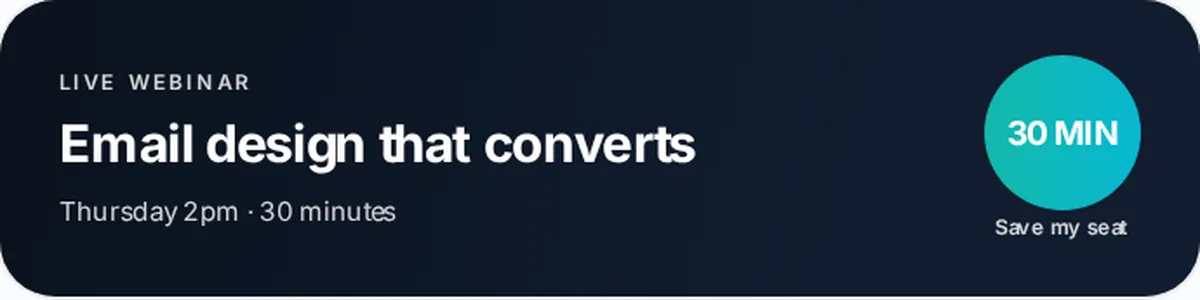
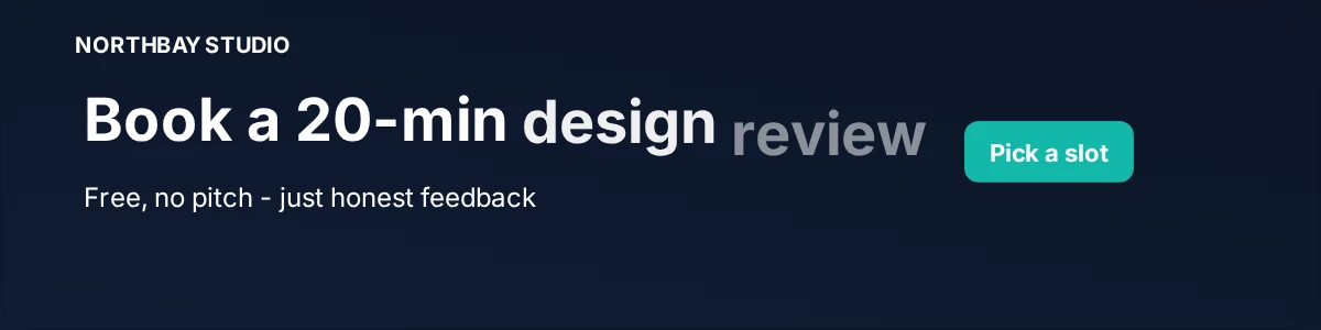
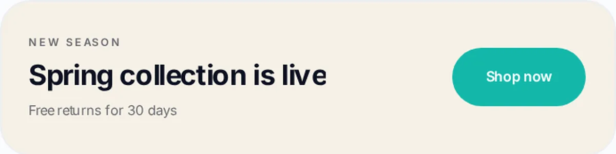
Every example below is a real Bannerly design at 600 × 150. Open one in the editor and change the copy, colours and animation to suit your brand.
1. Straight percentage off
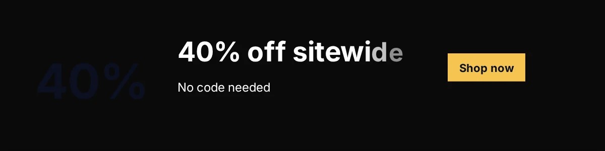
The simplest and usually the strongest, if your discount is genuinely competitive. One number, one action, nothing else competing for the space.
2. Limited-time offer
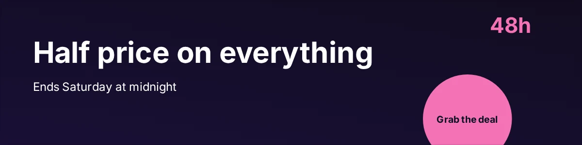
Urgency works when it is true. Name the actual end point - 'ends Saturday at midnight' beats 'for a limited time' because it is checkable.
3. VIP early access
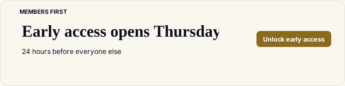
Good for list-building in the weeks before. The banner is not selling the discount yet - it is selling being first.
4. Free shipping
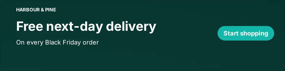
Often more persuasive than a small percentage discount, particularly for lower-priced items. It removes a friction point rather than shaving a few pounds.
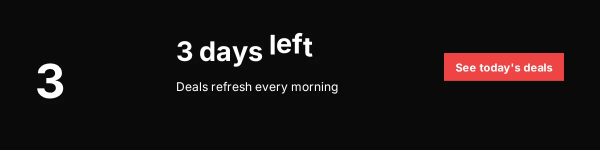
5. Countdown style
A GIF cannot count down in real time, but a 'three days left' banner you update daily gets most of the effect. Set a reminder - a stale countdown is worse than none.
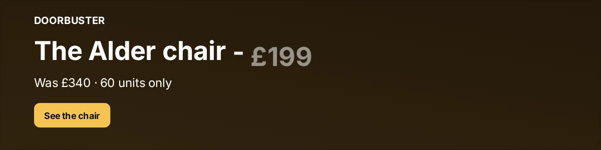
6. Product spotlight
One hero product with the old and new price. This works best when the product is recognisable enough to sell itself at 600px wide.
7. Black and gold luxury
For brands where shouting would be off-brand. Restraint, generous spacing, a small discount stated plainly. Motion, if any, should be a slow fade rather than a pop.

8. Minimal B2B promotion
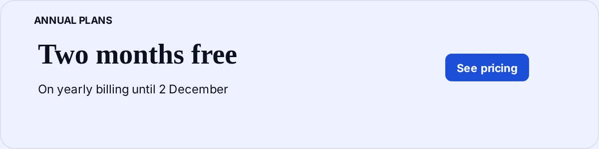
B2B buyers are on the same list as everyone else in November. A quiet, specific offer with a real deadline lands better than sale language borrowed from retail.
What separates a good Black Friday banner from a loud one
| Do | Avoid |
|---|---|
| One offer, stated in the headline | Stacking three offers into one banner |
| A concrete end date | Vague urgency language |
| High contrast between text and background | Dark text on a dark seasonal background |
| A button that names the action | 'Click here' |
| Motion on one or two elements | Everything animating at once |
- Avoid
- Stacking three offers into one banner
- Avoid
- Vague urgency language
- Avoid
- Dark text on a dark seasonal background
- Avoid
- 'Click here'
- Avoid
- Everything animating at once
Key terms
- Black Friday email banner
- A Black Friday email banner is a seasonal promotional image placed in an email or signature that states the discount, the deadline and the action to take.
- Banner variant
- A banner variant is one of several versions of the same design, swapped as a campaign moves through its phases.
Common questions
It is one of the better cases for animation, because the message is time-bound and the inbox is crowded. Keep it to one or two moving elements so the offer stays readable.